How CDW's Overloaded Navigation Was Killing Conversions
Situation
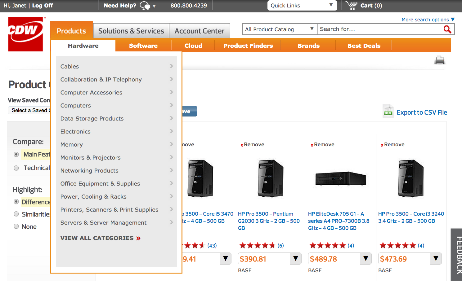
CDW's global navigation had become a bloated monster with over 200 items organized in a skeuomorphic design that reflected years of incremental additions without strategic oversight. The system overwhelmed users with choice paralysis while creating significant technical debt through redundant code, conflicting CSS styles, and multiple overlapping navigation patterns. Analytics showed that 60% of users bypassed navigation entirely, relying instead on search or direct links. Mobile performance was particularly poor, with navigation rendering taking up to 3 seconds. Internal stakeholders continued requesting new menu additions without understanding the cumulative impact on user experience or site performance.
Task
Lead a complete navigation redesign to reduce cognitive load, eliminate technical debt, align the information architecture with user mental models, and deliver measurable improvements in sitewide conversion rates. The solution needed to be scalable and maintainable while satisfying diverse stakeholder requirements across product categories, account management, and support functions.
Action
I launched a comprehensive research initiative, conducting 15 in-depth user interviews across key customer segments (IT professionals, procurement specialists, and small business owners) to understand navigation patterns, pain points, and mental models. I analyzed hundreds of hours of UserTesting videos to identify common failure points and the workarounds users had developed. Through detailed analytics review, I discovered that the Account Center was accessed more frequently than any product category, indicating users prioritized account management over product discovery.
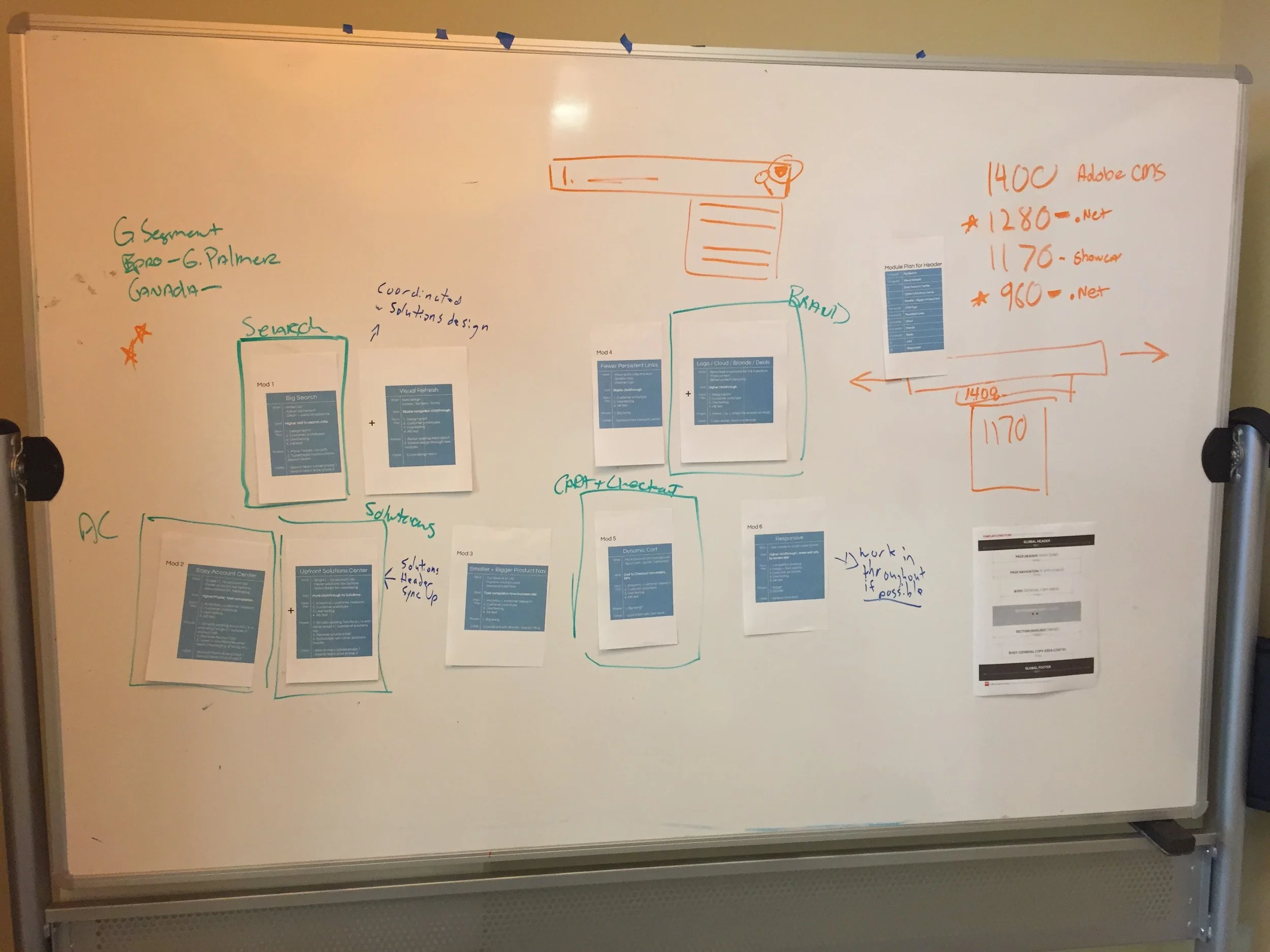
I facilitated collaborative whiteboarding sessions with cross-functional teams including Product Management, Engineering, Marketing, and Sales to map critical user journeys and identify the most essential pathways. Using this research foundation, I designed new navigation structures based on user mental models rather than internal organizational charts. I created both low-fidelity paper prototypes for rapid stakeholder iteration and high-fidelity Axure prototypes for development handoff and executive buy-in.
To validate the designs, I conducted 24 moderated usability testing sessions across three rounds of iteration, refining the structure based on user feedback and task completion rates. Simultaneously, I set up A/B tests in collaboration with the analytics team, comparing the current navigation against two proposed versions to measure impact on conversion rates and user engagement. Throughout the process, I worked closely with Product Managers to prioritize features based on business impact and collaborated extensively with the development team to ensure technical feasibility while addressing performance requirements.
Result
The redesigned navigation system delivered a 7% sitewide conversion lift, representing millions in additional annual revenue across CDW's billion-dollar e-commerce platform. User behavior analytics showed a 23% increase in direct navigation to key product categories and a 31% improvement in account management task completion rates. Technical performance improvements were equally significant, with page load times decreasing by 1.2 seconds on average and mobile navigation rendering improving by 2.8 seconds. User satisfaction scores for site navigation increased dramatically from 2.8/5 to 4.1/5 in post-launch surveys. The new modular design system reduced future development time for navigation updates by 40% and provided a scalable foundation that could accommodate business growth without returning to the previous bloated state.


